Apple Finances
Directed digital-first creative for Apple's financial ecosystem: Apple Card, Apple Cash, and Apple Pay, translating complex financial products into clear, trustworthy visual stories across global touchpoints.
The challenge
Apple's financial products (Apple Card, Apple Cash, and Apple Pay) needed creative that made secure, complex financial features feel simple and trustworthy at a glance. The challenge was driving awareness and adoption of new features while holding Apple's premium brand standard and clearly setting its ecosystem apart from every other finance app competing for the same screen.
I led design across Apple's finance sector, partnering with cross-functional product and production teams to turn technical feature sets into creative that felt as considered as everything else Apple ships.
The process
Working closely with design, product, and production partners, I translated complex financial features like security protocols, reward structures, and payment flows into visuals that read as simple without oversimplifying what they were protecting. Where a feature had no obvious visual metaphor, that translation was the actual design problem to solve, not just a production step afterward.
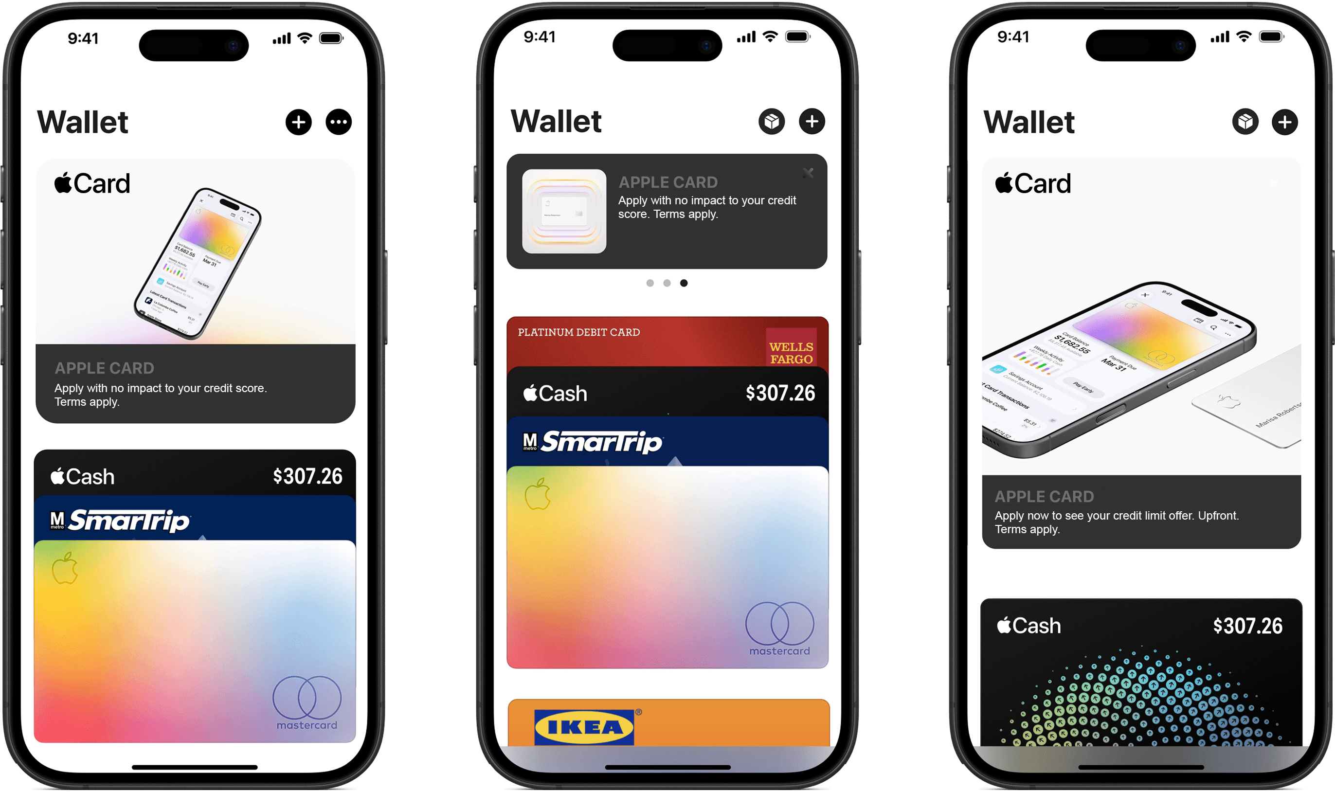
I led the creation of modular, scalable asset systems across email, web banners, social, OOH, DOOH, and the Apple Wallet app, built so the same creative logic held whether someone met it on a billboard or inside the Wallet app itself. That system carried through to designing Apple's 2025 new feature page on their website, applying Apple's design standards and layout systems to keep it consistent with everything else in the ecosystem.
The outcome
Delivered campaign creative across Apple Card, Apple Cash, and Apple Pay: email, web, social, OOH, DOOH, and the Apple Wallet app, under one consistent visual system
Designed Apple's 2025 product features page, extending that system to the company's highest-visibility digital surface
Translated technical financial features into creative that drove awareness and adoption without sacrificing Apple's brand standard
The real design problem was never the layout. It was trust: making people feel safe handing Apple their money in the same glance it took to feel delighted by an ad. Every version of this work got simpler, not because simple is easier, but because simple is what trust looks like at a glance.
*Please respect the confidentiality of this project. This work was completed under NDA and is shared here using only publicly available, non-confidential materials.